At First Glance, The New Twitter Profile Looks Just Like Facebook
Hope you like Facebook, because Twitter appears to be testing a major new redesign for its homepage that should look familiar.

By Sadho Ram — 12 Feb 2014, 02:11 PM — Updated about 12 years ago
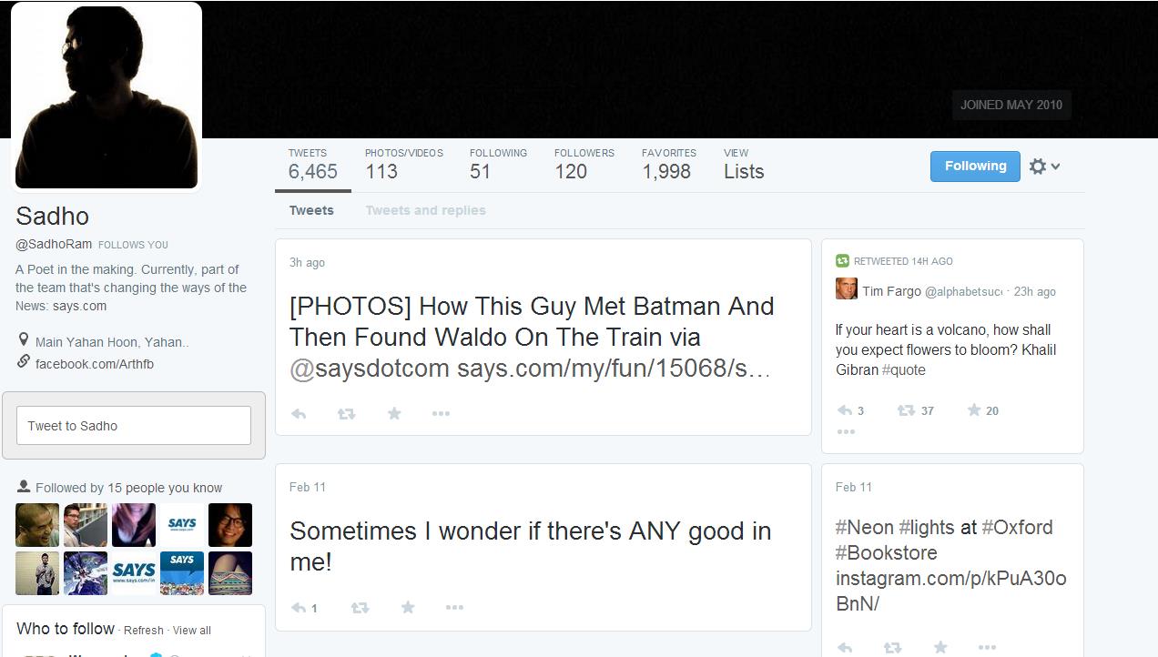
In its continued quest to make its product more accessible to the masses, Twitter has begun testing a new visual redesign of its profile pages that looks a lot like Facebook and Google+
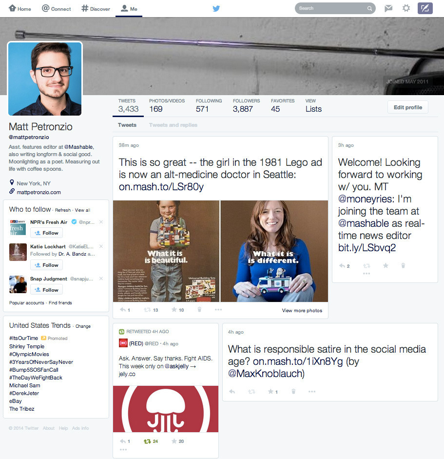
The redesign, as it appears to a small sample of users who began to see the new look on Tuesday, takes an individual user's header photo and stretches it across the top of the page, much like Facebook's "cover photo."
 theverge.com
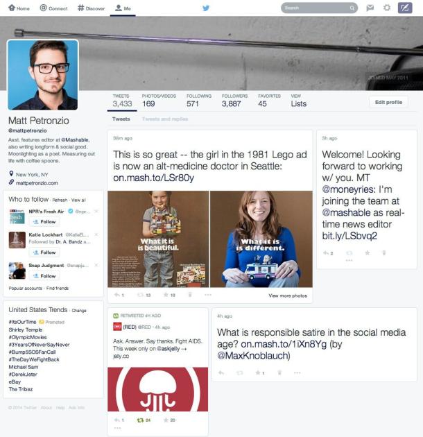
Likewise, profile pictures are bigger in size and shifted to the side, and users can now more easily sift through tweets that contain photos and video, which overall seem to get a lot more emphasis on the page.
 thewire.com
Tweets no longer flow vertically in a single column like they do now, instead they spread out with a tile-style layout very similar to what you might expect from a Pinterest or Facebook’s new Paper app
A separate new feature offers pop-up notifications with fields for easy replies for direct messages sent through the platform, and similar notices for RTs and favorites.
 techcrunch.com

The features are being seen separately, but if both are implemented you start to get a picture of a future where Twitter moves away from its mostly single column, simple look to a richer, more complex presentation that offers up additional information, but in a way totally alien to what users are used to from the social network.
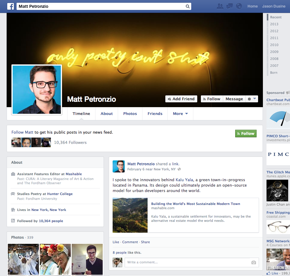
cnet.comSo, when we clump all of these changes together, it's easy to see that Twitter has gone full Facebook mode. Here's take a look at this comparison:
It's common for Twitter to quietly test new features and design updates before tweaking or rolling it out to a larger user base. Experiments typically go out to a small, random pool of users.
It's unclear if today's test will make its way to all users or get canned by Twitter engineers. What we do know is that Twitter is thinking about abandoning the text-based vertical stream layout that made it so famous — for profile pages, at least. The funny part is that Facebook recently ditched its mosaic-view Timelines in favor of vertical streams.
 theverge.com
While Twitter has declined to comment on the story, initial reaction among users seemed to be generally negative about the potential redesign
Tweets, such as one from @handeebks that read, "DEAR TWITTER: I love you bc you AREN'T like Facebook. Don't f**k that up. Love, Me" were the norm in the wake of the Mashable report.
cnet.com