Google Changed Its Logo But Can You Spot The Difference?
Google adjusted the letters in its logo ever so slightly that it might actually be one of the most minor edits in logo history.

By Sadho Ram — 28 May 2014, 02:46 AM — Updated almost 12 years ago
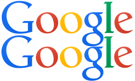
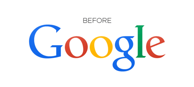
Can you spot the difference? These are the two versions of Google's logo, the one below is the new one.
Well, without fanfare, Google has changed its logo for only the third time in a decade – by just two pixels. Yes!
The minuscule change was spotted by eagle-eyed Redditors, with the fact that it was even picked up on being testament to the brand's power and omnipresence. The change basically comes down to kerning, with Google adjusting the letters to improve the logo's readability and decipherability.
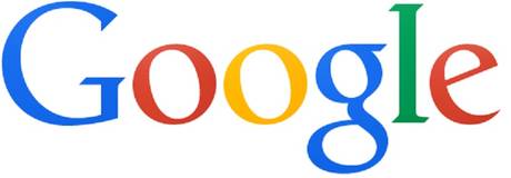
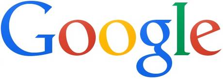
As any good design nerd knows, lazy kerning can be the source of a major headache. And nothing feels better than seeing those letters pushed, pixel by pixel, into their proper place. In Google's case the bottom of the"l" and "e" didn't quite lineup, and as redditor nal1200 noted, "[That] must have driven some design employee crazy." To fix it, Google moved the "g" one pixel to the right and the "l" one pixel down and to the right.
 gizmodo.com
In case you're still having trouble spotting the difference, here's a GIF that will make things easy:
A Google logo-adjustment isn't unprecedented, though

Google has fiddled with its logo countless times throughout its history, previously switching from a more textural style to a more blank one, as many brands like eBay also have.
From the company which famously a/b tested which shade of blue to use in adverts – and made $200m in the process – you can be sure the decision wasn't made lightly.
 theguardian.com